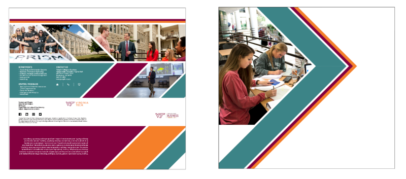
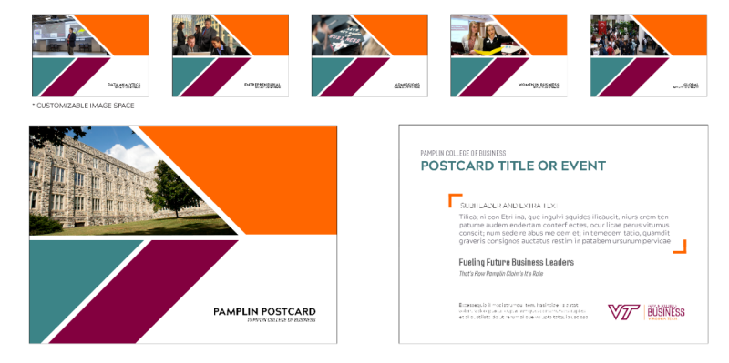
Brand Visual Style
The visual standards for publications and all other media ensure that communications from Pamplin speak with a clear and uniform voice that best represents the image and brand of Pamplin and all brand guidelines put forth by the university.
These include:
- Use of the Pamplin logo
- Use of teal as a primary accent color in addition to maroon and orange
- Predominance of sans-serif fonts, both for headlines and body text
- Primary photography focusing on the environment of the subjects shown with hands-on interaction
- A contemporary uncluttered design with liberal use of white space and a color palette that reflects a forward-looking approach
- All Pamplin marketing materials should use the official Pamplin lockup. Departments have their own secondary lockups that can be used in marketing materials
- Incorporation of branded graphic elements like diagonal photo masks and blocks.
Visit the university's Brand Center for more information and to download lockups, fonts, and other graphic elements. Visit the Brand Center for approved contracted vendors for graphic design, freelance videography, and more.
Examples